
Blue Gold Interior Design: 8 Ideas for 2026

Blue and gold interiors have a rich historical association with luxury. Natural ultramarine, made from lapis lazuli, was once valued at or above the price of gold. This scarcity, combined with gold's association with wealth and ceremony, helps explain why the pairing still feels luxurious today.
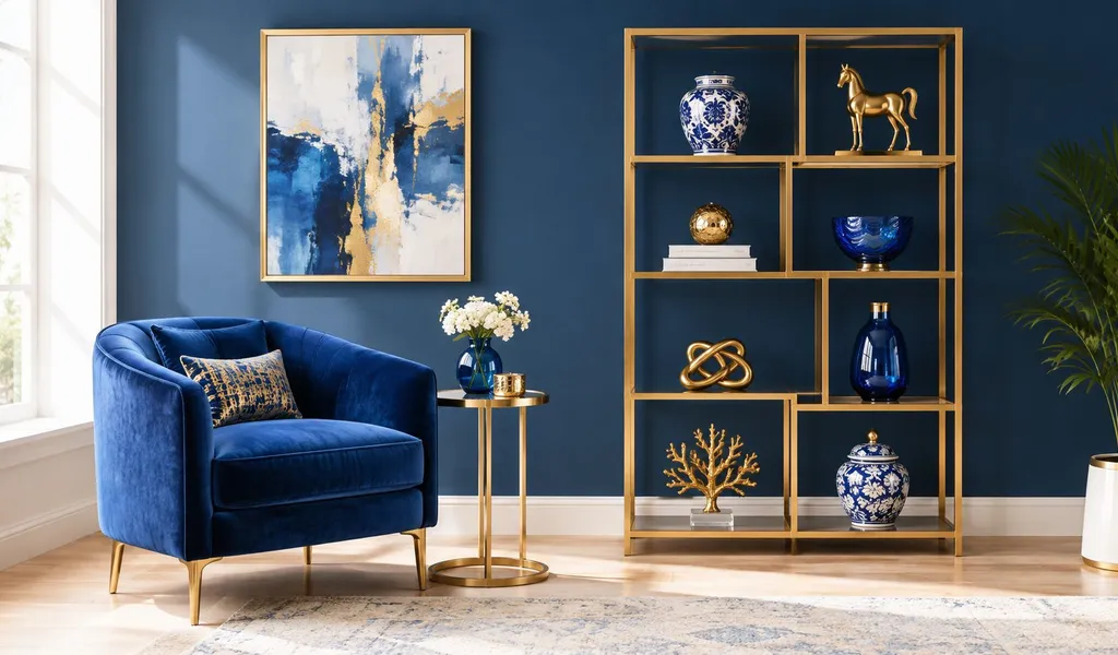
Blue establishes mood, depth, and visual calm. Gold introduces warmth, light, and a focal point. Navy walls with polished gold suit formal rooms, while pale blue with brushed brass feels lighter. Jewel tones create drama, coastal blue supports relaxed living, and steel blue brings refinement to industrial spaces.
The eight applications below compare blue gold interior design by mood, material, room suitability, buyer appeal, staging risk, and contrast level. Choose based on room size, natural light, architecture, and whether you're designing for yourself or preparing a property for market.
Table of Contents
- 1. Classic Gold Accents with Navy Blue Walls
- 2. Jewel Tone Blue Velvet with Gold Accents
- 3. Coastal Blue and Gold Luminosity
- 4. Contemporary Minimalist Blue-Gold Geometry
- 5. Eclectic Bohemian Blue-Gold Fusion
- 6. Art Deco Revival with Deep Blue and Brass Gold
- 7. Transitional Elegance with Soft Gold and Slate Blue
- 8. Luxe Industrial with Steel Blue and Matte Gold
- Blue & Gold Interior Styles: 8-Point Comparison
- Choose the Right Blue-Gold Direction
1. Classic Gold Accents with Navy Blue Walls
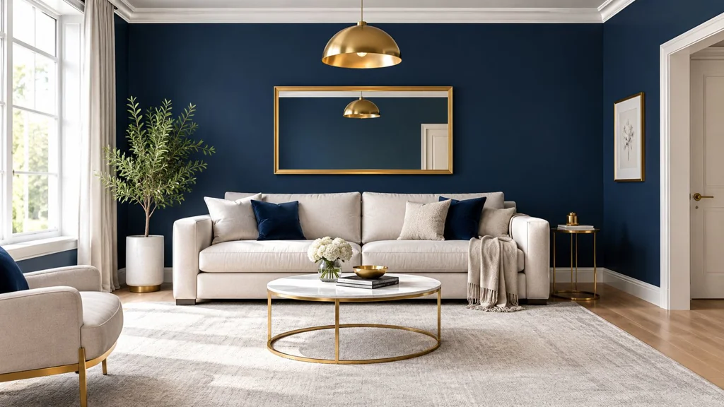
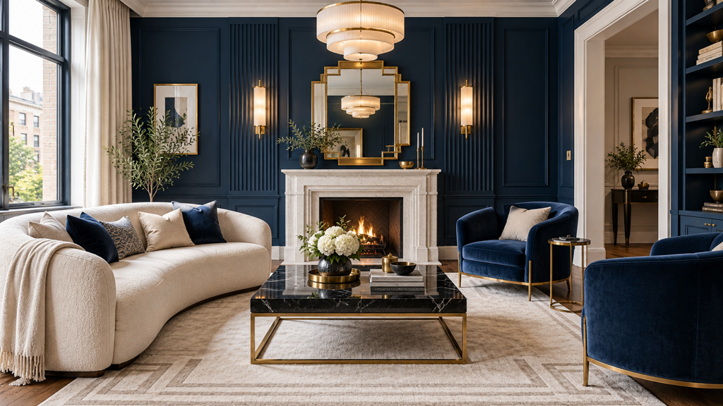
Navy walls create a strong architectural backdrop, especially in living rooms, bedrooms, dining rooms, and studies with adequate daylight. Gold then works best as a controlled accent rather than a second dominant color. Use it on a pendant light, mirror frame, cabinet hardware, picture frames, or a pair of side tables so the eye moves through the room without treating every surface as a focal point.
This is the most formal of the eight approaches. It suits a Manhattan-style apartment with traditional trim, a London showroom with tall windows, or a Chicago Gold Coast townhouse where architectural detail can support a richer palette. The mood is composed and established, but navy can absorb light in a small or north-facing room. Cream, white, or light gray upholstery and natural wood furnishings prevent the room from becoming visually heavy.
Practical rule: Let the navy carry the room and let gold mark the important points.
A useful starting hierarchy gives blue approximately 60–70% of the visual palette and gold 10–30%, with the remainder assigned to neutrals or natural wood. Treat that allocation as a design heuristic, not a universal benchmark. Test paint and metallic samples under the room's actual daylight and evening lighting before committing.
For property marketing, use RoomStaging's interior design tools to brighten navy surfaces, test cream or gray upholstery, and compare furniture arrangements without changing doors, windows, or circulation. Generate daytime and evening versions. The principal staging risk is over-formality, so keep the furniture comfortable and use gold in lamps, mirrors, and one or two accessories rather than covering the room in reflective finishes.
2. Jewel Tone Blue Velvet with Gold Accents
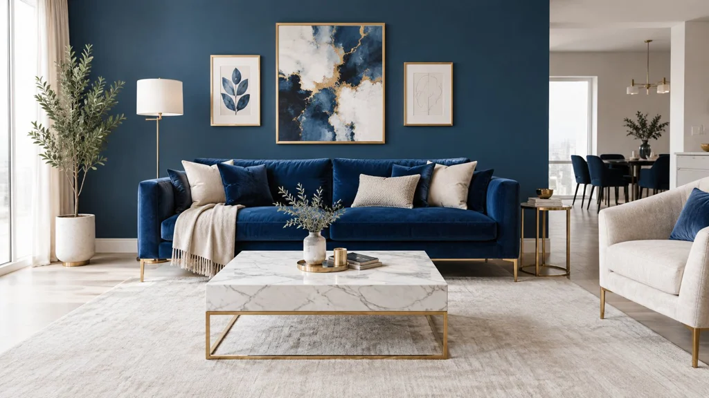
Jewel-tone blue changes the conversation from quiet sophistication to visual drama. Brighter sapphire, cobalt, and teal shades can feel more vivid than deep navy, so they need material contrast to avoid looking flat. Velvet supplies that contrast through its directional nap, while gold appears in the sofa legs, a sculptural lamp, a mirror, or a carefully selected frame.
This application works particularly well in a living room, cocktail room, creative studio, or bedroom where the owner wants personality rather than broad neutrality. A Brooklyn loft, a Miami Art Deco-inspired apartment, or a contemporary Los Angeles renovation can support the combination because the architecture gives the saturated colors room to perform. In a smaller room, use the jewel tone on one wall or one major furnishing instead of wrapping every surface in blue.
Balance sheen with quieter surfaces
Velvet already catches light. Polished gold, glossy lacquer, and marble can push the room into excessive glamour when used together. Balance the composition with pale flooring, natural oak, matte plaster, or light gray upholstery on secondary seating. The result still feels rich, but the room remains legible in photographs and comfortable in person.
The buyer appeal is strongest for design-forward homeowners, creative professionals, and clients who want a memorable interior. The staging risk is that the room can look highly personal or difficult to furnish around. A bright, controlled lighting setup helps reveal velvet texture instead of turning the sofa into a dark mass.
RoomStaging's virtual staging workflow can compare sapphire, cobalt, and teal upholstery while preserving the room's existing proportions. Test a polished-gold version against brushed brass, then create an evening view with lamps switched on. A marble coffee table may strengthen the luxury reading, but natural wood is often the safer choice when the property needs warmth and wider buyer appeal.
3. Coastal Blue and Gold Luminosity
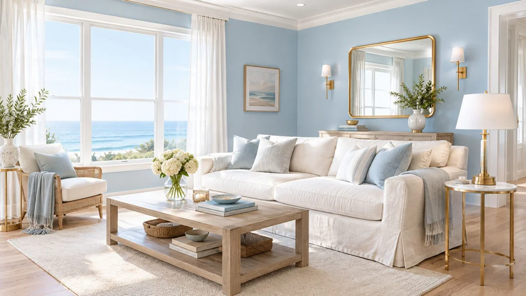
Coastal blue and gold is the most forgiving of the eight directions. Powder blue, seafoam, periwinkle, and soft blue-gray create an open mood, while gold stays restrained in picture frames, drawer pulls, lamp bases, or a slim console. White, sand, linen, pale oak, and stone keep the materials relaxed rather than resort-like. The result requires low contrast and suits rooms where daylight, views, and natural texture should lead.
This direction fits beachfront homes, Florida waterfront properties, Hamptons-style houses, and Mediterranean-inspired properties in warmer inland regions. It also works in family rooms because durable, easygoing materials support daily use. Buyer appeal is broad: the palette feels bright and livable, with less staging risk than saturated blue. Its weakness is a lack of identity if gold appears only as disconnected accessories instead of relating to the architecture or furniture.
Light is the main design variable. North-facing rooms can make pale blue look cooler, while warm evening light may pull it toward gray or green. Metallic surfaces also change with light direction and color temperature. Evaluate color, nature-inspired materials, and warm neutrals together when weighing design appeal and resale use.
Soft blue can feel more luxurious than saturated navy when strong daylight, natural texture, and restrained metalwork support it.
Stage the room with a white sofa, woven chairs, linen curtains, pale rugs, and one warm wood element. Correct dull exposure in listing images, but retain shadows that show depth. Daytime, golden-hour, and evening versions demonstrate that the room does not rely on one photographic condition. For a coordinated exterior concept, RoomStaging's exterior design feature lets you test whether a brighter facade or refreshed landscaping supports the pale interior palette, using a separate exterior photo.
4. Contemporary Minimalist Blue-Gold Geometry
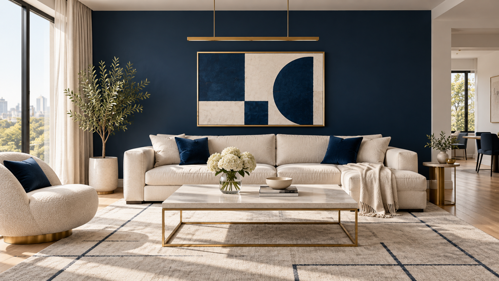
Minimalist blue and gold depends on editing. Instead of distributing ornaments across the room, use one geometric rug, one abstract artwork, a linear light, or a pair of structured chairs to establish the palette. Blue can appear as a single wall, a built-in cabinet, or a large rug. Gold should provide an edge, line, or point of reflection rather than a decorative layer.
This approach is a strong match for contemporary penthouses, converted industrial lofts, and modern developments where windows, concrete, stone, or cabinetry already provide visual structure. It also suits buyers who value restraint. The mood is focused and architectural, with a high contrast requirement but a low tolerance for clutter.
Start with the room's geometry
Remove furniture from the visual test before adding anything new. A clear view of windows, door openings, sightlines, and circulation reveals whether the architecture can support a bold blue surface. If the room has awkward proportions, an oversized gold mirror may exaggerate the problem. A precisely placed artwork or a blue built-in can restore the visual balance without calling attention to itself.
A representative digital navy is RGB (0, 0, 128), hex #000080, while a saturated digital gold is RGB (255, 215, 0), hex #FFD700. Screen values are starting points for mood boards and visualization, not direct matches for paint, fabric, or metallic coating. The physical gold finish, whether brushed, satin, polished, or antique, will change the result substantially.
Use crisp track lighting or simple architectural fixtures, but test glare on artwork, glass, and metal. RoomStaging's furniture removal and regeneration options are useful for comparing a single statement chair with a pair of chairs, or a blue wall with a blue rug. Keep the final composition sparse enough that buyers can understand the floor plan immediately.
5. Eclectic Bohemian Blue-Gold Fusion
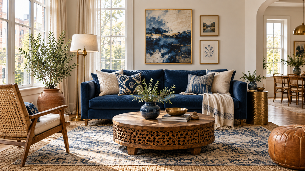
Eclectic blue and gold welcomes variation. Cobalt cushions can sit beside indigo ceramics, aged brass, patterned textiles, terracotta, carved wood, and woven materials. The palette becomes less about matching and more about creating a controlled relationship between repeated colors, changing textures, and objects with distinct visual histories.
This is the right choice for an artist loft, a Southwestern home, an Austin creative residence, or a vacation rental where memorability matters. It can make an otherwise ordinary room feel specific and photographable. The trade-off is clear. Layering creates personality, but every additional pattern competes for attention. Without a dominant focal point, the room reads as clutter rather than collected.
Layer by scale, not by accident
Begin with one large blue element, such as a sofa, rug, or painted wall. Add a medium-scale pattern in a related blue, then introduce gold through aged metal, a frame, or a lamp. Finish with smaller objects in terracotta, cream, or natural fiber. This sequence gives the eye a path through the room.
Warm, diffused lighting usually supports the textiles better than cold overhead light. Use artisanal objects selectively, and leave enough negative space around the strongest pieces. For staging, generate a restrained version first, then add layers one at a time. That makes it easier to identify which object adds character and which one merely adds noise.
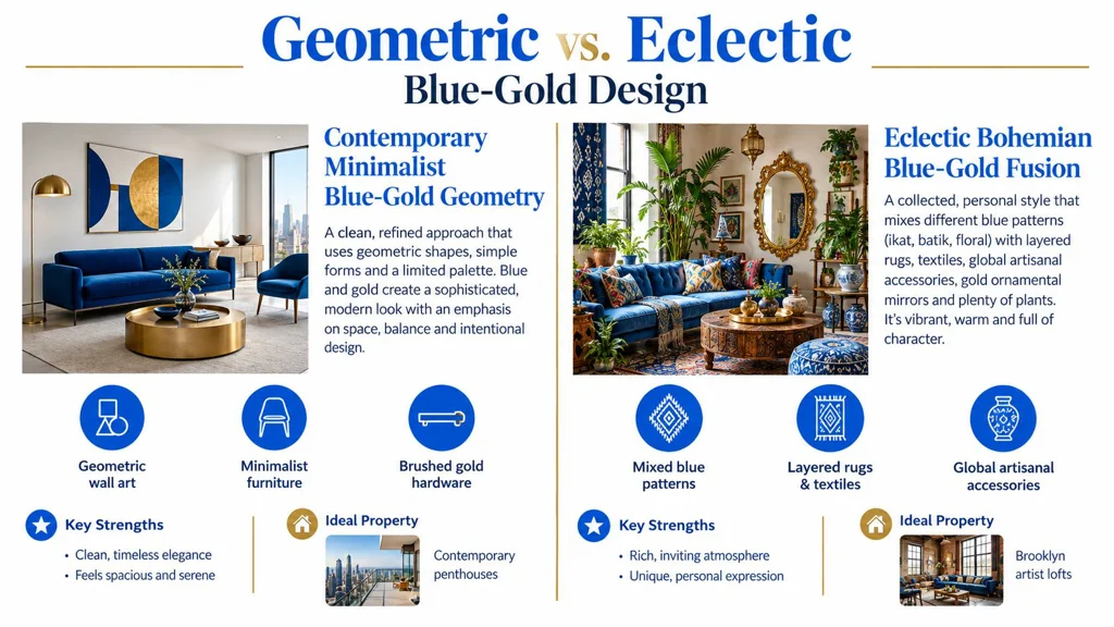
The contrast between minimalist geometry and bohemian layering is especially useful for visual review. A side-by-side concept can show whether the property's architecture supports expression or needs a cleaner presentation.
Blue and gold also work well with warmer, more natural interiors. Apartment Therapy’s 2025 design forecast, based on a survey of 154 designers published in December 2024, found that earth tones were preferred to jewel tones by 55% of surveyed designers, while maximalism led minimalism by 68% to 32%. These findings suggest a useful adjustment to the classic formula: ground intense blue and gold with oak, linen, stone, terracotta, or aged brass instead of relying on glossy finishes alone.
6. Art Deco Revival with Deep Blue and Brass Gold
Art Deco blue and gold requires stronger geometry than a general glamorous interior. Use symmetrical pairs, stepped forms, fan motifs, fluted surfaces, lacquer, marble, and brass to create a deliberate period reference. Deep navy or indigo provides the dark field, while warm brass gives the room its reflective punctuation.
The approach is particularly effective in pre-war Manhattan apartments, Miami Art Deco properties, restored historic hotels, and boutique hospitality interiors. It suits rooms with a mantel, a strong entry axis, a distinctive staircase, or original decorative details. The buyer appeal comes from character and craftsmanship, but the staging risk is historical overstatement. A room can quickly become theatrical if every object announces the same era.
Use symmetry as the organising device
Place matching sconces around a mirror, center a pendant over the main seating arrangement, or align artwork with the fireplace and rug. Symmetry gives the room confidence even when the accessories remain modern. Choose one or two period references, then let contemporary upholstery and clean-lined tables prevent the space from becoming a replica set.
Brass often works better than bright yellow gold in this context because its warmth feels connected to architectural metalwork. High-shine surfaces can be effective around a bar, console, or mirror, but matte and satin brass reduce glare in listing photographs. Test the room from the camera position as well as from the doorway. A reflective surface that looks elegant in person can create a bright hotspot in a wide-angle image.
Use warm, dramatic lighting to reveal brass and blue contrast, but maintain enough ambient light for the floor plan to remain clear. In a property listing, produce a balanced daylight image alongside the more atmospheric evening version. That pairing communicates both character and usability.
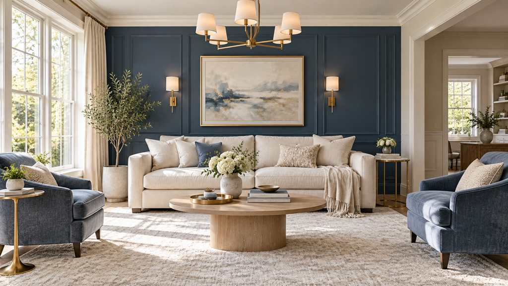
7. Transitional Elegance with Soft Gold and Slate Blue
Transitional blue and gold is the safest choice when a room needs sophistication without a strong period or lifestyle identity. Slate blue is quieter than cobalt and less formal than blackened navy. Pair it with warm gold lighting, neutral upholstery, pale carpet, natural wood, and simple artwork. The room should feel established, but not decorated around a single trend.
This application works in suburban residences, executive apartments, luxury model homes, and urban properties where the audience is broad. It has lower staging risk than jewel tones or eclectic layers because most of the room remains neutral. The principal danger is blandness. If slate blue, beige, and gold are all too muted, the space can lose focal hierarchy.
Keep the neutral field generous
Use slate blue on a feature wall, built-in, headboard, or occasional chair rather than assuming that every wall needs color. Add gold through a chandelier, mirror edge, cabinet pull, or artwork detail. Warm white and cream usually create a more welcoming result than stark white, particularly when the metal finish has yellow or brass undertones.
This is also the easiest version to adapt between personal design and property marketing. A homeowner can add stronger art and textiles later, while an agent can keep the room calm enough for listing photography. Furniture scale matters more than ornament. A substantial sofa, correctly sized rug, and clear walking route can present the room more effectively than a collection of small gold accessories.
Generate two or three furniture layouts to test whether the room supports conversation, television viewing, or a work zone. Keep color correction accurate. Over-warming the image may make gold look orange and slate blue look muddy, while excessive brightness removes the depth that makes the palette attractive.
8. Luxe Industrial with Steel Blue and Matte Gold
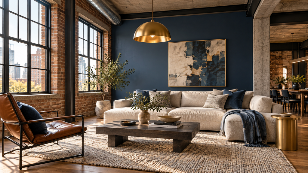
Industrial blue and gold works because it pairs cool architectural materials with a controlled warm accent. Steel blue complements exposed brick, concrete, blackened steel, timber, and large factory windows. Matte gold or aged brass then softens the composition without competing with the raw surfaces.
This style fits warehouse lofts in Brooklyn, adaptive-use buildings in Chicago and Portland, and urban apartments in Austin or Denver. It appeals to buyers who want authenticity with a measure of polish. The contrast level is medium to high, but the material contrast matters more than color saturation. A steel-blue wall against concrete can be effective even when the gold is limited to a faucet, pendant, or cabinet handle.
Preserve the building's evidence
Don't cover every exposed surface to make the room look finished. Brick, concrete, beams, ducts, and original windows communicate the property's value. Add a minimal sofa, a substantial rug, and a few refined fixtures so the room feels intentional rather than unfinished.
Matte gold is usually more successful than polished gold here. It picks up warm light without creating a showroom effect, and it photographs with less glare. Use it on a kitchen tap, dining pendant, shelving brackets, or a small side table. A large glossy gold coffee table would shift the room toward glamour and weaken the industrial argument.
For listing work, correct exposure and perspective while preserving texture in the brick and concrete. A clean before-and-after concept can show how styling improves the room without disguising its original character. Test an uncluttered daytime view and a warmer evening view with directional light across the raw materials. The best result looks expensive because the architecture is respected, not because the room contains more decoration.
Blue & Gold Interior Styles: 8-Point Comparison
| Style | Implementation complexity | Resource requirements | Expected outcomes | Ideal use cases | Key advantages |
|---|---|---|---|---|---|
| Classic Gold Accents with Navy Blue | Medium, needs careful lighting and balance | Moderate, metallic fixtures, quality paint, lighting | Sophisticated, photogenic luxury look | Luxury living rooms, bedrooms, high-end listings | Timeless elegance; versatile with multiple furniture styles |
| Jewel Tone Blue Velvet with Gold Accents | High, bold color + texture demands precise staging | High, velvet upholstery, designer lighting, curated accessories | Dramatic, highly shareable visuals that stand out online | Trend-forward apartments, boutique hotels, showrooms | Strong social/media appeal; tactile richness and visual impact |
| Coastal Blue and Gold Luminosity | Low–Medium, relies on natural light and airy styling | Moderate, light finishes, soft furnishings, subtle gold accents | Bright, spacious, broadly appealing and livable look | Beachfront homes, vacation properties, family residences | Wide market appeal; makes spaces feel larger and welcoming |
| Contemporary Minimalist Blue-Gold Geometry | Medium, precision in composition and negative space | Moderate, quality minimalist furniture, custom art pieces | Gallery-like, refined, architecturally focused presentation | Modern penthouses, minimalist lofts, contemporary builds | Clean, sophisticated aesthetic; highlights architecture |
| Eclectic Bohemian Blue-Gold Fusion | High, complex layering requires expert styling | High, diverse textiles, artisanal objects, layered rugs | Distinctive, memorable, personality-driven imagery | Artist lofts, creative rentals, boutique properties | Highly original and emotional; appeals to creative buyers |
| Art Deco Revival with Deep Blue and Brass Gold | High, period references and symmetry need care | High, brass finishes, geometric fixtures, high-gloss surfaces | Dramatic, cinematic, historically curated presentation | Historic apartments, restored hotels, period renovations | Strong differentiation; high perceived value and drama |
| Transitional Elegance with Soft Gold and Slate Blue | Low, straightforward to execute with balanced styling | Moderate, neutral furnishings, warm gold accents | Timeless, broadly marketable, easy-to-stage results | Suburban homes, executive apartments, model homes | Broad buyer appeal; easy to adapt for resale staging |
| Luxe Industrial with Steel Blue and Matte Gold | Medium–High, needs material upkeep and curated finishes | Moderate–High, quality industrial furniture, material restoration | Authentic, character-forward presentation for urban buyers | Loft conversions, adaptive-reuse properties, urban condos | Showcases architectural bones; authentic upscale industrial vibe |
Choose the Right Blue-Gold Direction
The strongest blue gold interior design scheme isn't necessarily the most dramatic one. It is the version that matches the property's architecture, the room's light, and the audience's tolerance for color. A dark navy wall can make a formal living room feel grounded, but it may make a compact bedroom appear smaller. Pale blue can open a coastal room, but it may need warm wood or aged metal to avoid feeling cold. Jewel tones reward confident styling, while transitional slate blue gives a wider group of buyers an easier starting point.
Choose coastal blue and gold when daylight, water views, family living, or relaxed luxury leads the brief. Keep the furniture light, use linen and natural textures, and limit gold to small points of reflection. Choose transitional slate blue and soft gold when the property needs broad appeal. It works across suburban and urban settings because neutral upholstery and restrained accessories allow buyers to imagine their own furniture.
For formal luxury, start with navy and classic gold or Art Deco deep blue and brass. Navy is calmer and more adaptable, while Art Deco requires stronger symmetry and architectural character. Jewel-tone blue with velvet is better for a property that can support personality, texture, and a more editorial presentation. It can be compelling in a loft, boutique-style residence, or entertaining room, but it shouldn't be the only visual option in a listing aimed at a broad audience.
Use minimalist geometry where the architecture already has clean lines, large openings, or strong built-in elements. One geometric artwork or one blue architectural plane can do more than a dozen accessories. Choose eclectic bohemian layering for creative homes and hospitality settings where character is more important than neutrality. Keep a clear focal point so the room feels collected rather than crowded. For exposed brick, concrete, timber, or steel, luxe industrial styling should preserve those materials and introduce matte gold sparingly.
Light and photography deserve the same attention as furniture. Designers and homeowners should compare north- and south-facing conditions, cool and warm artificial light, daytime, evening, and the actual camera viewpoint. Polished gold can create glare and hotspots, while brushed, satin, or aged finishes usually communicate warmth with less reflection. Fixr’s 2025 Interior Design and Color Trends Report, based on a survey of 67 experts in October 2024, found that 85% believed soft or warm whites in the main living area would add the most value when selling, and 76% recommended warm neutrals for a main bedroom. These are expert opinions, not measured resale gains. The findings are a useful reminder that a bold blue-and-gold concept may be excellent for a design brief but less suitable as the only staging image.
Before buying paint, furniture, or hardware, test the complete room rather than isolated swatches. Use a redesign to compare blue temperatures, furniture removal to inspect architectural bones, enhancement to correct exposure and perspective, and regeneration to test layouts and metal finishes. Keep doors, windows, passageways, and proportions unchanged so the comparison reflects a plausible room rather than an attractive but misleading concept.
A practical workflow is to create a calm version, a dramatic version, and a commercially safer version. For example, compare navy with polished gold, navy with brushed brass, and pale blue with champagne gold. Digital colors such as #000080 and #FFD700 can help teams align on a starting direction, but physical samples and finish specifications must make the final decision because screens emit light while paint, fabric, and metal reflect it.
The right blue and gold approach should make the property easier to understand, not harder. Match the palette to the room's scale, let the architecture determine the contrast, and use metallic finishes to guide attention rather than dominate the image. That discipline preserves the historic luxury association of the pairing while making it practical for contemporary homes and property marketing.
RoomStaging lets you test navy, coastal blue, jewel tones, slate blue, and steel blue with different furniture, lighting, finishes, and layouts before making physical changes. Upload a room to compare redesigns, remove furniture, enhance the existing photo, and generate realistic blue-and-gold variations, then visit RoomStaging to start exploring the direction that fits your property.