
8 House and Roof Color Combinations: Palettes That Sell

You're standing in front of a listing photo, and the roof makes or breaks the first impression. A white facade under a gray sky can look unfinished, while the same house with a darker, warmer roof reads as grounded and maintained. That's why house and roof color combinations should be chosen together, not one at a time.
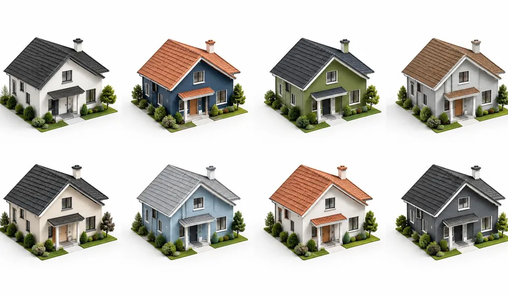
Climate narrows the field fast. Roof reflectivity changes how much heat the building takes on, and colour can affect cooling load in a real way, with Lawrence Berkeley National Laboratory guidance noting that white roofs can reflect up to 90% of incoming sunlight, while dark roofs absorb much more solar energy. Neighborhood rules matter too, because the palette that looks right on one block can feel out of place on another. The eight combinations below run from safest to bolder, so you can shortlist what fits the architecture, then test it in RoomStaging before anyone orders paint or shingles.
Table of Contents
- 1. Classic White House with Dark Gray or Black Roof
- 2. Warm Beige or Cream House with Terracotta or Clay Roof
- 3. Charcoal Gray House with Slate or Architectural Gray Roof
- 4. Pale Yellow or Butter House with Black or Dark Brown Roof
- 5. Soft White or Off-White House with Green or Sage Roof
- 6. Rich Burgundy or Deep Red House with Black Metal Roof
- 7. Soft Blue or Coastal Gray House with Light Gray or Weathered Roof
- 8. Stone Gray or Charcoal House with Copper or Bronze Metal Roof
- 8 House & Roof Color Combinations
- Turn These Pairings Into a Shortlist That Works
1. Classic White House with Dark Gray or Black Roof
A white exterior with a dark charcoal or black roof is one of the clearest reads in residential real estate. In listing photos, it gives the house a defined outline instead of a washed-out facade, and it suits homes where the siding, trim, and roofline need to look deliberate rather than busy.
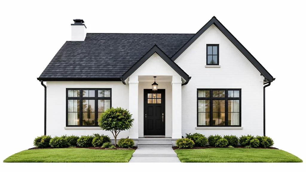
The trade-off is thermal, not visual. For this high-contrast pairing, specify the roof's tested solar reflectance and thermal emittance instead of relying on color name alone, and check HOA rules before ordering near-black samples. The U.S. Environmental Protection Agency notes that cool roofing materials can stay about 28–33°C cooler at the surface than conventional roofing during peak summer weather, so a roof that looks dark from the street may still perform differently if it has a reflective coating or a product designed to reduce heat gain.
Where it reads best
This pairing is reliable on Colonials, modern farmhouses, and clean-lined suburban homes. It also holds up well in overcast weather, because the dark roof stops the facade from looking flat or incomplete.
For listing photos, keep the walls bright, the roof matte or low-gloss, and the trim simple. If the home already has strong architectural lines, the roof should frame them, not fight them.
A quick exterior preview can save a bad paint or roofing order. Use RoomStaging's front curb appeal ideas for inspiration, then test black, deep charcoal, and softer trim combinations before you commit, especially when neighbourhood rules or resale expectations are in play.
2. Warm Beige or Cream House with Terracotta or Clay Roof
A warm beige or cream facade with a terracotta or clay roof feels natural on Spanish and Mediterranean homes because both materials read as sun-warmed and grounded. The palette works best when the wall colour stays soft enough to let the roof supply the character, not fight it.
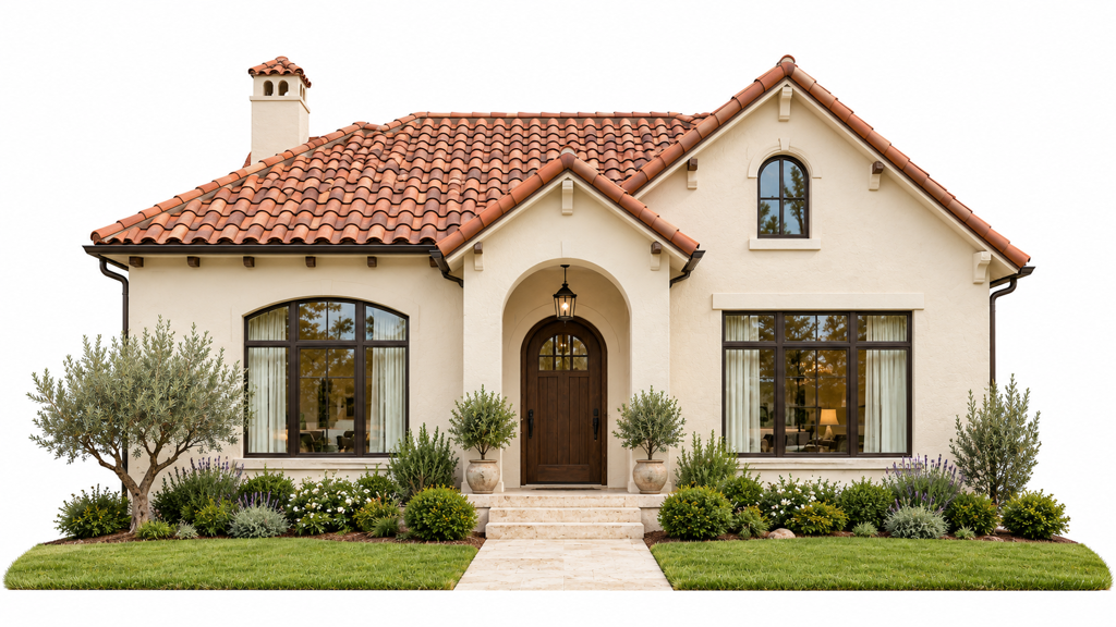
In warm climates, the practical question is not the colour name, it is how the roof performs. A clay-look product can still hold heat if the finish is dark or poorly rated, so check the manufacturer's tested reflectance and cooling specs before you order. If the home sits in a hotter market, that check matters as much as the colour match.
How it sells in photos
This pairing can photograph beautifully, but beige is easy to push into yellow if the light is wrong. In strong sun, terracotta gives the house an established, coastal feel. In flat afternoon light, the same roof can read too orange unless the walls stay restrained.
Keep the facade warm, not golden. Once the cream shifts toward mustard, the house starts to look older than intended, and the listing image loses crispness.
This palette fits Spanish Revival homes in Southern California, Mediterranean estates in Florida and Arizona, Tuscan-inspired homes, and Southwest properties. It also works with olive trees, stone paths, and drought-tolerant planting because the whole exterior reads as one story.
For sellers, the useful test is visual, not theoretical. Preview the same beige facade with two terracotta values in RoomStaging with morning and late-afternoon lighting, then check when the walls start drifting yellow. That side-by-side view helps you choose a roof tone that fits neighbourhood expectations and still looks right in listing photos before you commit to paint or tile.
3. Charcoal Gray House with Slate or Architectural Gray Roof
A charcoal facade with a slate or architectural gray roof reads clean and controlled, which helps in listing photos when the goal is to show shape, not noise. The palette works best as layered grayscale. Wall, roof, and trim need enough separation to keep the elevation legible from the curb and in a thumbnail.
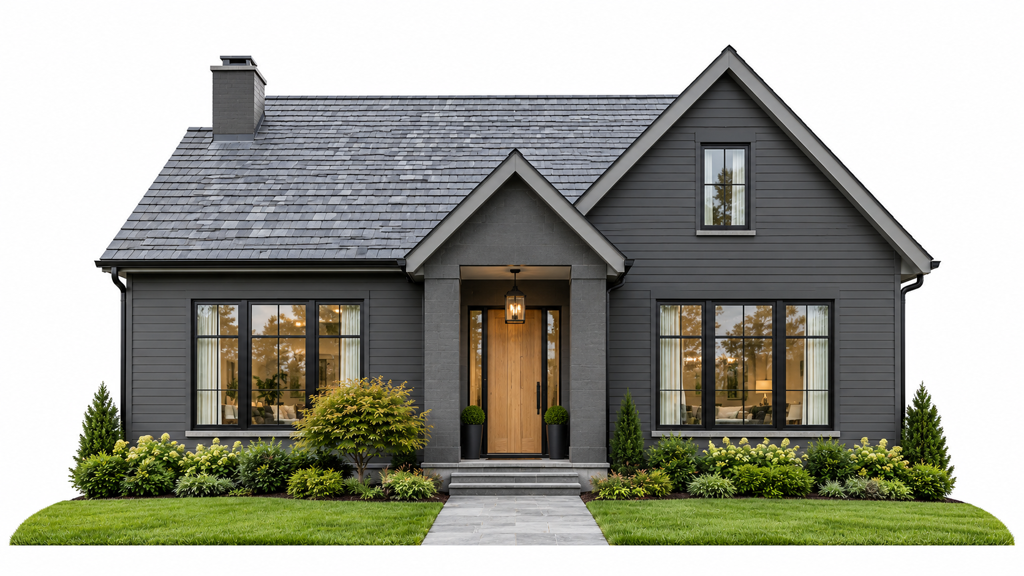
For layered grays, test wall and roof value separation at thumbnail size in RoomStaging. If the two grays merge into one block, lighten the trim or shift the roof by one value step.
What works and what doesn't
This combination fits modern townhouses, mid-century renovations, and new-build homes with strong window rhythm. It also suits neighborhoods where dark exteriors are allowed but a full black roof would feel too heavy. The trade-off is clear, darker grays look sharp, yet they can flatten a facade if the roof and walls are too close in tone.
- Best trim choices: white, warm wood, or soft black, tested against the charcoal wall in overcast light.
- Best accent colors: deep navy, muted bronze, or a natural wood front door.
- Avoid: two nearly identical grays that erase depth and make the house read as one dark mass.
This palette sells when the roofline, windows, and entry stay easy to read. White trim keeps the facade crisp in photos, warm wood softens the severity, and soft black trim gives a tighter, more modern edge. In bright sun, too much contrast can expose patchy paint or mismatched materials. In flat light, the same pairing can look elegant if the values are separated enough.
RoomStaging is useful here because you can preview the same charcoal house with different roof tones, trim colors, and window frames before paint or roofing is ordered. That side-by-side check helps a seller choose a version that fits the street, holds up in the neighborhood, and still looks intentional in listing photos.
4. Pale Yellow or Butter House with Black or Dark Brown Roof
Soft yellow is one of the easiest ways to make a house feel welcoming without going sugary. When it's paired with a black or dark brown roof, the exterior gets the contrast it needs to stay structured in photos.
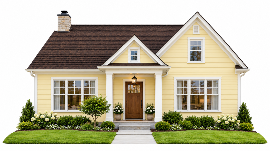
This pairing often fits farmhouse and cottage architecture because the colour story is simple: bright walls, grounded top. It also works on older homes where the roofline is prominent and needs a darker cap to keep the elevation from feeling top-heavy. Dark roofs can be appropriate in colder climates where winter heating benefits matter more, but the same roof can be a liability in cooling-dominated areas, so the climate decision has to come before the colour preference.
Where the palette succeeds
A butter facade and dark roof can look excellent in rural Midwest farmhouses, small-town cottages, and classic New England-style homes. The roof gives the house a frame, while the yellow keeps the exterior from feeling severe.
The danger is oversaturation. If the yellow leans neon or the roof goes glossy black, the house starts reading as stylized instead of timeless.
Use this pairing when the home needs friendliness more than drama. It's also a strong choice for listing photos because it photographs well against a blue sky and green lawn, which makes the exterior feel complete without much staging. If the existing roof is aging, color correction should focus on warmth, not brightness, because a washed-out yellow facade can make the whole property look tired. For sellers, this is a sensible palette when the goal is to improve curb appeal without making the home feel trendy.
5. Soft White or Off-White House with Green or Sage Roof
A soft white house with a green or sage roof reads calm in listing photos and still feels specific enough to stand out. It suits buyers who want character without a loud contrast, and it usually ages better than a brighter pairing that can look dated after a few seasons.
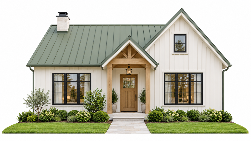
The palette works best when the rest of the exterior supports it. Green roofs sit naturally with warm wood, natural stone, and layered planting, so the facade does not feel isolated from the yard. For sellers, that matters because the roof line and the front setting are judged together in photos. These landscaping curb appeal ideas help here, since the planting plan should reinforce the roof tone rather than compete with it.
Why it works in the market
This combination fits Scandinavian-inspired farmhouses, eco-conscious homes, and modern renovations that need a softer identity. It also works in neighborhoods where white facades are common, because the roof adds distinction without fighting local expectations.
Judge sage and moss roof products by their rated reflectance and emittance sheet, not the colour name, and confirm availability in your region before shortlisting. That check matters because two roofs can look similar on a sample board and behave differently once they are on the house.
In RoomStaging, render the same soft-white facade with muted sage, celadon, and moss roofs under both daylight and shade. The version that looks balanced in daylight can go muddy on camera once the light turns flat, so test the roof against the actual exterior before committing to paint or roofing.
6. Rich Burgundy or Deep Red House with Black Metal Roof
Burgundy or deep red walls are not for every property, but they can look exceptional when the architecture has enough weight to support them. Paired with a black metal roof, the exterior gets drama without losing structure.
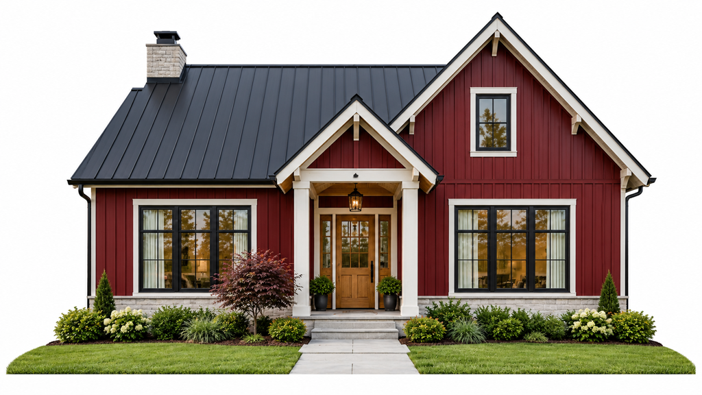
This palette works because the wall colour does the emotional work and the roof does the framing. On barn-style homes, transitional facades, and higher-end farmhouse builds, that contrast can feel expensive rather than loud, especially when the roof has crisp seams and the trim stays controlled.
How to keep it from going too heavy
The risk is simple. If the burgundy is too dark and the roof is too matte, the home can disappear in flat light. If the red leans too bright, the exterior turns theatrical and becomes harder to sell from photos.
- Use precise exposure: deep reds shift fast in overcast conditions.
- Keep trim disciplined: white or soft charcoal usually works better than another saturated colour.
- Show it at different times of day: morning, late afternoon, and golden hour each tell a different story.
The best real-world fit is a house with strong form, good roof geometry, and a buyer pool that likes character. It's common to see this palette on barn conversions, modern farmhouse estates, and transitional homes with industrial details. A black roof can be the right visual counterweight here, but only if the property has enough daylight and the final listing images are corrected carefully so the facade doesn't sink into shadow.
7. Soft Blue or Coastal Gray House with Light Gray or Weathered Roof
Soft blue, coastal gray, and slate blue give a house a calm, easy read. With a light gray or weathered roof, the facade shifts toward a coastal feel that suits homes near water, open sky, or long horizontal views.
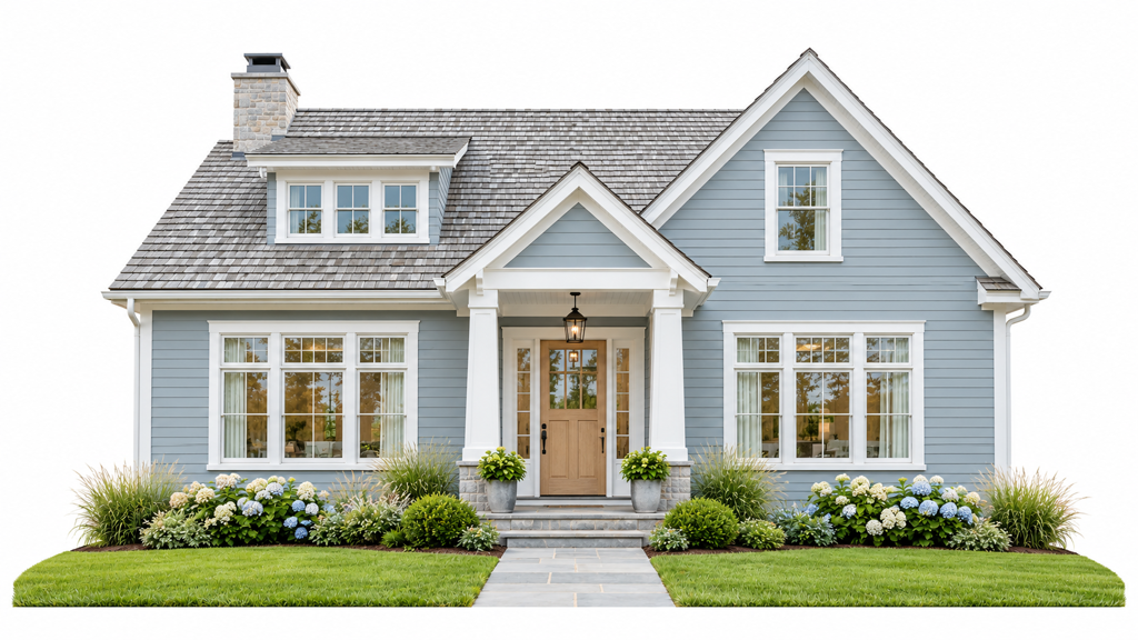
For this pairing, the practical question is how it reads from the street and in listing photos. A light roof can look flat if it matches the wall too closely, so keep it at least one value step off the trim and wall colour. That small difference helps the house keep dimension in bright sun and in thumbnail images.
A weathered roof finish often works better than a crisp pale gray when the goal is softness. It gives the surface texture, which matters on camera and on larger roof planes. Preview the same blue-gray facade with two weathered-gray roof textures in RoomStaging, because shingle grain can change the result more than the colour chip does.
The listing-photo advantage
This palette usually photographs well because the tones stay controlled under strong light and do not compete with the sky. It fits coastal properties in California, Florida, and the Carolinas, Hamptons-style homes, and waterfront houses where the exterior should feel relaxed rather than formal.
Neighbourhood rules also matter here. In some areas, a soft blue wall colour is welcome only if the roof stays muted and the trim stays restrained. If the trim is white, the roof needs enough contrast to keep the facade from washing out. If the trim is warmer, the blue should stay subdued so the house does not drift into a pastel look.
Practical rule: If the roof is meant to read weathered, the texture has to support that story. Colour alone will not carry it.
This is a good palette to test before painting or reroofing, especially when the seller wants a cleaner coastal look without making the house feel pale or unfinished.
8. Stone Gray or Charcoal House with Copper or Bronze Metal Roof
A stone gray or charcoal house with a copper or bronze roof belongs in the premium end of the market. The appeal comes from contrast, cool walls below and warm metal above, which gives the building a crafted, finished feel.
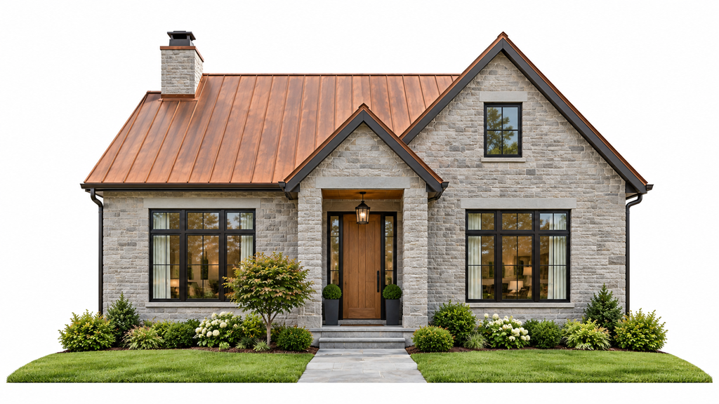
This pairing is strongest when the home has enough architectural restraint to let the materials speak. A copper roof doesn't need a lot of extra color around it, because the metal itself becomes the focal point as it ages and changes tone.
How to sell it honestly
The biggest issue with copper and bronze is expectation management. Natural copper develops a patina; bronze-coloured coated metal does not develop the same finish. Buyers may respond to the brightness of new metal, but the roof will change over time, so the listing should show the actual material and texture rather than an overly polished simulation. RoomStaging's exterior design feature is useful here because it can present different exterior concepts without pretending a finish will stay static forever.
A metal roof should be previewed in daylight and with aging in mind. If the homeowner hates patina, they should know that before installation.
This palette is common in luxury contemporary estates, high-end modern architecture, and new construction with premium finishes. It also works when the rest of the exterior is quiet, because the roof becomes the jewellery rather than the whole outfit. Use a stone-gray facade if the goal is sophistication, or a deeper charcoal if the goal is more drama. In either case, the roof should look like a deliberate material choice, not a novelty.
8 House & Roof Color Combinations
| Title | Implementation complexity | Resource requirements | Expected outcomes | Ideal use cases | Key advantages |
|---|---|---|---|---|---|
| Classic White House with Dark Gray or Black Roof | Low, standard paints and roofing | Low–Medium, routine cleaning for white walls; common roof materials | Timeless, high-contrast curb appeal; broad visual appeal | Colonial, modern farmhouse, suburban listings nationwide | Broad appeal; easy exterior previews; clearly defined roofline |
| Warm Beige or Cream House with Terracotta or Clay Roof | Medium, tile roofing and color matching | Medium, terracotta maintenance; climate-appropriate landscaping | Warm, Mediterranean/resort-like aesthetic; photogenic in golden light | Spanish Revival, Mediterranean estates, Southwest/California/Florida markets | Inviting, cohesive palette; pairs with drought landscaping; regional character |
| Charcoal Gray House with Slate or Architectural Gray Roof | Medium, quality materials and trim coordination | Low–Medium, durable roofing; careful accent selection | Contemporary, sophisticated, cohesive monochrome look | Urban townhouses, contemporary new builds, modern renovations | Highly photogenic for modern buyers; conceals dirt; versatile trim options |
| Pale Yellow or Butter House with Black or Dark Brown Roof | Low–Medium, shade selection critical | Medium, routine cleaning; careful photography to avoid casts | Warm, welcoming, distinctive curb appeal | Farmhouses, cottages, rural and suburban homes | Cheerful, family-friendly appeal; stands out in listings; photographs well in daylight |
| Soft White or Off-White House with Green or Sage Roof | Medium, specialty roof colors/material choices | Medium, potentially higher roof material costs; color availability varies | Subtle modern twist; eco-conscious, nature-linked aesthetic | Sustainable new builds, Scandinavian-inspired farmhouses, progressive markets | Distinctive yet elegant; appeals to eco/design-conscious buyers |
| Rich Burgundy or Deep Red House with Black Metal Roof | Medium–High, precise color application and coordination | Medium, upkeep to maintain rich tone; careful lighting for photos | Dramatic, memorable statement with strong marketing impact | Modern farmhouse estates, barn conversions, upscale transitional homes | Extremely distinctive; distinctive marketing images; premium perceived value |
| Soft Blue or Coastal Gray House with Light Gray or Weathered Roof | Low–Medium, color balance and coastal materials | Medium, coastal-grade materials; light roof maintenance (algae) | Serene, resort-like aesthetic; strong appeal for waterfront properties | Coastal homes, beachfront and Hamptons-style properties, waterfront estates | Evokes relaxation and luxury; photogenic with water/sky; pairs well with coastal landscaping |
| Stone Gray or Charcoal House with Copper or Bronze Metal Roof | High, metal roof installation and expert color coordination | High, expensive materials; specialist installation; finish-dependent ageing | Premium, high-end luxury appearance; perceived craftsmanship | Luxury contemporary estates, architecturally significant homes | Conveys luxury and uniqueness; extremely photogenic; copper patina adds character |
Turn These Pairings Into a Shortlist That Works
The fastest way to choose between house and roof colour combinations is to stop treating them like abstract swatches. Start with the home's architectural style, the neighbourhood's expectations, and the climate first, then shortlist two or three pairings that fit those constraints. A roof that looks great in a mood board can still fail in a real listing photo if it clashes with the siding value, the tree line, or the block's general rhythm.
Render each option on the actual exterior photo, not on a generic render, and compare them side by side at thumbnail size. That's where the decision usually shows up. The combination that reads most clearly in a small image often wins, because buyers first encounter the property on a screen, not from the driveway.
Climate should stay in the conversation until the end. Roof colour can materially affect cooling performance, and the Berkeley and EPA guidance makes that clear, so a seller in a hot region shouldn't pick a dark roof just because it looks strong in isolation. In a heating-dominated market, the calculation shifts, which is why there's no universal “best” palette.
Maintenance matters too. Dark roofs can hide some staining, but they can also make heat control harder. Light roofs may perform better in summer, but they show dirt sooner and can change the whole personality of the facade. Metal roofs, specialty coatings, and reflective products all carry different long-term commitments, so the final call should reflect how much upkeep the homeowner can tolerate, not just what looks fresh on day one.
RoomStaging is useful at this stage because it lets you preview the exterior in context before anyone commits to a material order. Confirm the final colours and finishes with physical samples. That makes the conversation more practical, especially when the seller, agent, or builder needs to defend a colour decision with something more concrete than taste.
If you're comparing roof and wall colours for a listing, use RoomStaging to test the same facade in a few realistic combinations before you commit. Its exterior redesign tools can show how the house reads in different lighting, with different materials, and in the actual frame buyers will see online. Visit RoomStaging to preview the exterior first and make the colour choice with more confidence.