
10 Modern Front Desk Ideas for Better Curb Appeal

A front entry is one of the few property features buyers can judge before they step inside, yet “front” doesn't always mean the same thing. It might be a porch, a raised deck, a covered stoop, a facade, or the full sequence from sidewalk to front door. The strongest modern front desk ideas treat that sequence as a visual system, not a collection of disconnected finishes.
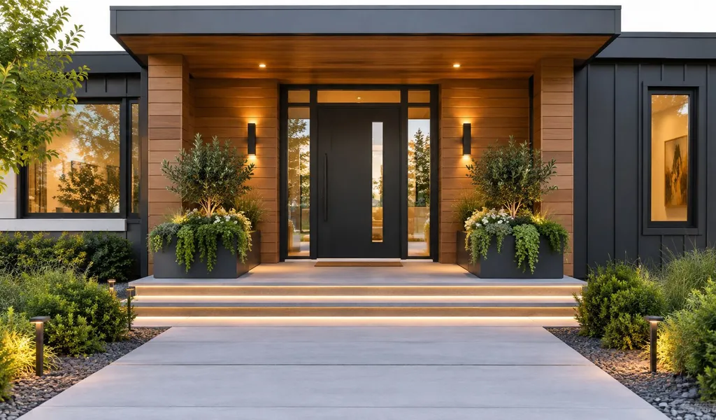
Front porches are also mainstream rather than niche. A 2026 summary citing the National Association of Home Builders reported that 67% of about 1 million single-family homes started in 2024 included porches. That makes the entry relevant to builders, sellers, buyers, and remodelers alike. The question is which concept fits the property's architecture, audience, site conditions, and maintenance tolerance.
The ten ideas below compare geometry, materials, planting, zoning, lighting, transparency, and perceived lifestyle. Each includes practical trade-offs and a RoomStaging scenario, so you can upload an existing exterior photo, choose redesign preferences, preserve visible architecture, and compare photorealistic variations before committing to a renovation or listing image. The finished guide is designed for quick scanning, with short subsections, decisive insights, and a small number of relevant internal RoomStaging links. No external links are added.
Table of Contents
- 1. Minimalist Modern with Clean Lines
- 2. Biophilic Design with Living Elements
- 3. Industrial Chic with Exposed Materials
- 4. Warm Transitional Style with Mixed Materials
- 5. Sustainable and Weathered Wood Decking
- 6. Contemporary Deck with Integrated Outdoor Living
- 7. Architectural Statement with Geometric Shapes and Angles
- 8. Luxury Materials and High-End Finishes
- 9. Multi-Level Deck with Visual Separation and Flow
- 10. Seamless Indoor-Outdoor Integration with Glazing and Transparency
- Modern Front Deck Ideas, 10-Point Comparison
- Turn a Front-Entry Concept into a Clear Preview
1. Minimalist Modern with Clean Lines
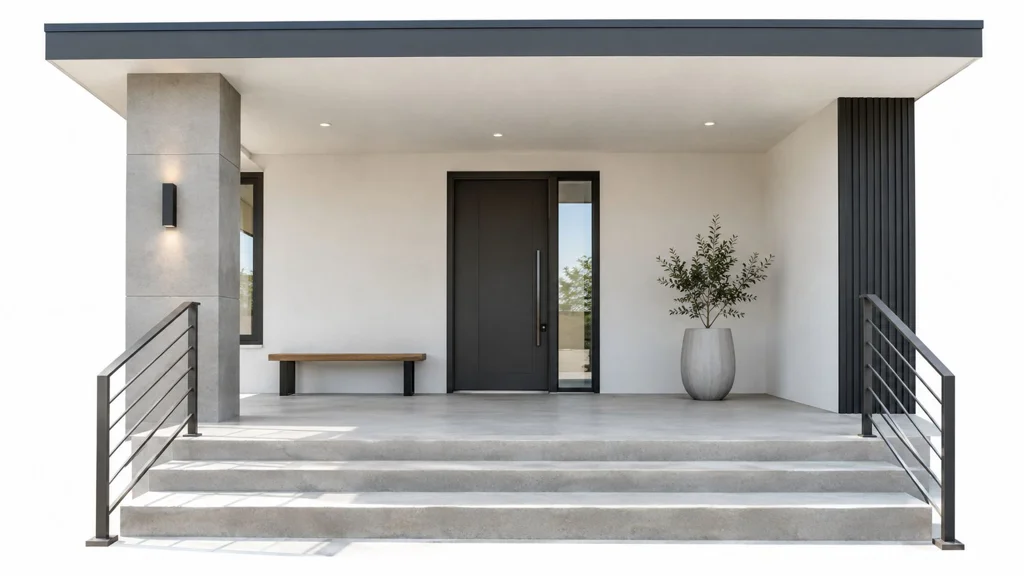
A minimalist entry works best when the architecture already has strong proportions. Think of a flat-roofed canopy, broad concrete steps, a dark front door, and one carefully placed bench rather than a porch crowded with accessories. Scandinavian-inspired homes, contemporary urban townhouses, and new construction with restrained landscaping can all support this direction.
The visual advantage is clarity. Straight edges, flat surfaces, and generous negative space help buyers read the entrance quickly in a listing thumbnail. Neutral materials such as concrete, pale wood, charcoal cladding, or composite decking keep attention on the door and the home's silhouette. The risk is sterility. Too much blank paving or too few soft elements can make the facade feel unfinished instead of refined.
Practical rule: Minimalism needs one or two deliberate human-scale details, not a completely empty entrance.
Use a single planter, a narrow outdoor bench, or a pair of low containers to show scale without disrupting the geometry. Avoid small decorative objects, mismatched pots, and furniture that's too large for the landing. A perspective correction and exposure adjustment can also make straight lines and material transitions read more accurately in marketing photography.
For a RoomStaging comparison, upload the existing exterior and generate versions with wood decking, concrete, and composite finishes. Add restrained seating or planters, then regenerate with warm and cool neutral palettes before the listing goes live. For more planting context, compare the result with these landscaping and curb appeal ideas.
2. Biophilic Design with Living Elements
A planted entry changes the perceived lifestyle of a property. Green walls, native planting beds, living railings, stone, and small water features suggest that the front area is part of daily life rather than a passageway to the door. The approach suits urban residences with limited ground space, suburban homes with room for pollinator planting, and contemporary properties that already use natural materials.
The strongest versions create contrast between hardscape and planting. A dark facade can support soft grasses and broad-leaved plants, while a pale wall may need deeper green foliage to avoid looking washed out. A green wall can provide immediate visual impact, but it also creates irrigation, trimming, and seasonal replacement responsibilities. Native planting usually offers a more credible long-term story, although it may look less polished in early establishment.
RoomStaging is useful here because exterior photos rarely show how planting will mature. Generate one restrained version with low planting, another with fuller seasonal growth, and a third with a vertical garden or living wall. A sky replacement and color correction can clarify the relationship between foliage, facade, and paving, but don't let enhanced greenery promise a maintenance level the owner won't sustain.
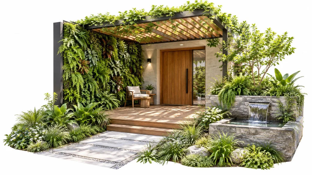
For a listing aimed at eco-conscious buyers, show the entry as a usable pause point with a simple seat and clear circulation. For a low-sun or compact lot, reduce the planting density and emphasize texture, stone, and containers instead of implying a lush garden that the site can't support.
3. Industrial Chic with Exposed Materials
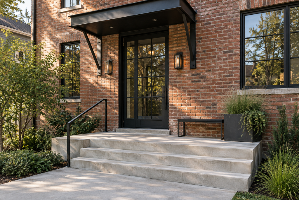
Industrial style has a clear visual vocabulary: exposed brick, concrete, steel framing, dark metal railings, and lighting that casts strong shadows across textured surfaces. It makes sense for converted warehouse lofts, artist studios, creative spaces, and townhouses whose construction already includes brick or structural metal.
Raw materials can look confident when they're authentic. They can look theatrical when they're applied as surface decoration to a conventional facade. A new brick veneer may complement an urban property, but excessive metal, heavy black paint, and hard concrete can make a modest front entry feel cold. Buyers also notice practical conditions, including rust, staining, slippery surfaces, and the effort required to keep textured materials clean.
Keep the staging sparse. A narrow metal-framed bench, one substantial planter, or a simple wall light gives the space purpose without softening it into a different style. The design should communicate durability and creativity, not a themed restaurant entrance.
RoomStaging can test the balance before construction or marketing. Upload the exterior, clarify brick and concrete texture with image enhancement, then generate alternate versions with clean steel, weathered metal, and warmer lighting. Regenerate from different lighting directions to see whether the facade's shadows reveal the materials or obscure the doorway.
A converted warehouse entry may benefit from dramatic contrast, while a suburban brick home usually needs only one industrial cue, such as a simple steel canopy or black railing. The more visually forceful the material, the more carefully the rest of the facade should be edited.
4. Warm Transitional Style with Mixed Materials
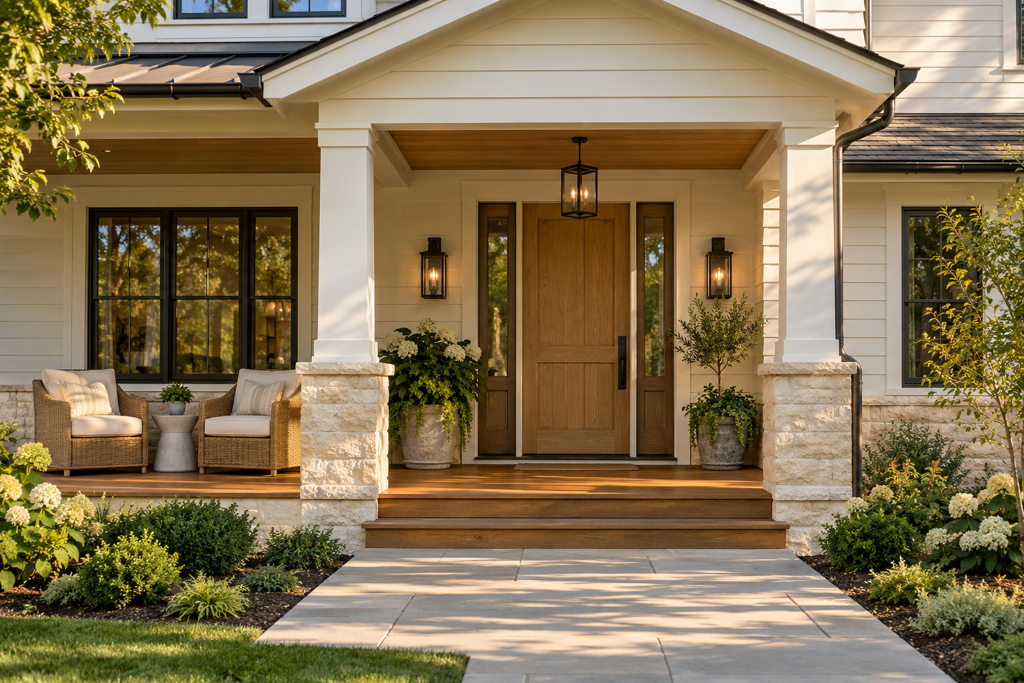
Warm transitional design is often the safest choice when a property must appeal to varied buyers. It combines contemporary lines with familiar materials, such as warm wood, neutral stone, dark metal, soft outdoor upholstery, and layered lighting. A suburban home with composite decking, a modern farmhouse with wood and metal railings, or a Craftsman-influenced property with contemporary furniture can all use the approach.
The key is proportion. Wood can make concrete feel more welcoming, while black metal can sharpen a traditional roofline. The combination fails when every material competes for attention. A facade with stone, brick, wood cladding, patterned tile, and ornate railings may photograph as busy even if each component looks attractive on its own.
Use the front entry to establish a restrained hierarchy:
- Primary material: Let one finish carry the largest visual area, such as siding, masonry, or decking.
- Supporting material: Add wood or metal where it improves warmth, structure, or contrast.
- Soft layer: Use cushions, planting, or a rug only where they help communicate use.
- Lighting layer: Place illumination at the door, along steps, or under a canopy rather than everywhere.
This concept photographs well because it provides enough texture to avoid flatness without narrowing the buyer profile. RoomStaging can generate several accent palettes, from black and oak to bronze and walnut, and can show the same porch in different daylight conditions. A virtual furniture arrangement should look curated, not like a catalog display. The best preview leaves room for buyers to imagine their own routines.
5. Sustainable and Weathered Wood Decking
Weathered wood creates a sense of age, craft, and connection to the outdoors. Cedar, reclaimed boards, and composite decking that imitates wood grain can support coastal homes, modern farmhouses, and contemporary residences where a natural finish would soften a hard facade.
The trade-off is that “weathered” must look intentional. Uneven staining, damaged boards, algae, or faded coatings don't communicate sustainability. They communicate deferred maintenance. Real wood may offer convincing grain and patina, but it needs ongoing care. Composite can reduce maintenance, yet some products look repetitive or overly uniform at close range. Buyers may also question heat retention, surface texture, and how well a material suits the local climate.
A good visualization separates appearance from assumption. Generate a clean new finish, a naturally aged version, and a low-maintenance composite option. Compare matte, satin, and natural surface treatments while keeping the home's existing geometry intact. Image enhancement can bring out grain and edge detail, but it shouldn't hide warped boards or deteriorated structure in a property photo.
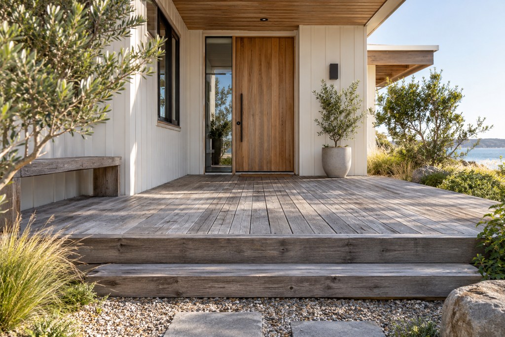
Use wood where it has a job. A deck surface, entry soffit, screen wall, or bench can provide enough warmth without wrapping the entire facade in timber. If the home already has wood siding, repeat the tone selectively rather than matching every surface.
RoomStaging's exterior redesign workflow lets a seller or designer compare these finishes before ordering materials. For marketing, show one polished version that represents the likely finished condition. For renovation planning, keep the original photo beside each variation so the difference in tone and perceived upkeep remains obvious.
6. Contemporary Deck with Integrated Outdoor Living
A front deck becomes more persuasive when it shows how residents might use it. Built-in seating, a small dining zone, integrated lighting, and a clear route to the door can turn an otherwise decorative platform into an outdoor room. The concept fits modern suburban homes, urban rooftop properties, and family residences with enough frontage for distinct activity areas.
Zoning matters more than the number of furnishings. A lounge chair placed directly in the main path makes the entry look blocked. A dining table that overwhelms the landing suggests the deck is too small. Built-in benches can save space, but they reduce flexibility for buyers who want to rearrange the area. Outdoor kitchens and fire features may add lifestyle appeal, yet they also introduce cost, safety, weather, and maintenance questions.
A front deck should show a believable routine, not every possible routine at once.
Create one scene for morning seating, one for casual entertaining, and one for a clean, mostly unfurnished listing image. Keep circulation visible in all three. Day and night versions are especially useful because integrated lighting can make a deck feel safe and welcoming after dark, but excessive illumination can flatten the facade and create glare.
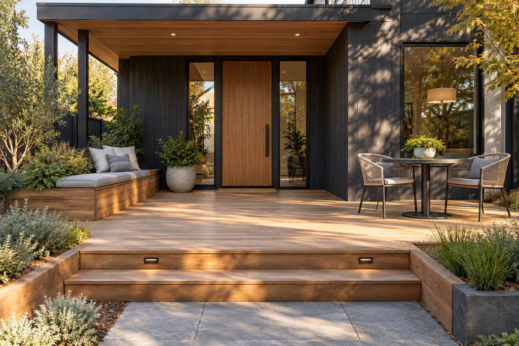
The exterior design feature can help you compare furniture placement, material sections, lighting treatments, and landscaping while preserving the visible building form. For a listing, use the strongest lifestyle view as a secondary image rather than replacing a clear architectural hero shot.
7. Architectural Statement with Geometric Shapes and Angles
Some entries earn attention through shape alone. Hexagonal platforms, angular railings, chevron surfaces, asymmetrical canopies, and sharply framed planting beds create a memorable first impression for architect-designed homes and design-forward residences.
Geometry works when it responds to the building. A diagonal deck can direct movement toward a recessed door or follow a sloping site. An angular railing may echo roof lines or window proportions. If the shape has no relationship to the architecture, it can look like an isolated visual trick. Complex patterns also create more joints, edges, and transitions to build and maintain.
Start with restraint. Test a strong canopy, a patterned deck, or an unusual railing, but don't combine several competing gestures in the same view. Minimal furniture helps buyers read the structure. A single sculptural planter can reinforce the composition, while a collection of small accessories will dilute it.
RoomStaging is valuable for testing geometry because a visual concept can be difficult to explain with material samples alone. Generate variations that emphasize different angles, rail patterns, and color contrasts. Use image enhancement to correct perspective, then compare whether the design still reads clearly from the camera position used for listing photography.
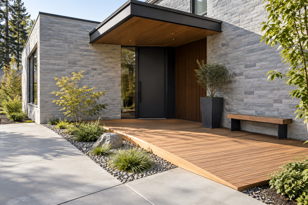
For a distinctive property, memorability can support positioning. For a conventional home, borrow one geometric idea and keep the rest familiar. The goal is a strong entry, not a facade that requires a design lecture before buyers understand it.
8. Luxury Materials and High-End Finishes
Luxury starts with consistency, not just expensive materials. Natural stone, refined composite decking, custom railings, carefully detailed trim, and high-quality outdoor furnishings can create a polished entry for an estate, waterfront property, or high-end suburban home.
The most convincing schemes limit the palette and emphasize craftsmanship. Large-format stone may look more substantial than a collection of small decorative pieces. A custom railing can define the architecture, but an ornate design may conflict with a minimalist facade. Premium outdoor furniture supports the lifestyle message, yet too much furniture makes the entry feel staged beyond its actual capacity.
Lighting reveals whether a finish is genuinely helping. Stone texture, metal reflectivity, and wood grain can disappear in flat daylight or become harsh under excessive spotlights. Generate daytime, evening, and overcast variations so the proposed materials aren't judged from one flattering condition. Reflections and surface quality should remain believable, especially around glazing and polished stone.
RoomStaging can place refined furnishings into the scene and test material colors before a seller, builder, or designer makes a costly commitment. Keep the original structure visible. A visualization that changes the porch proportions or invents architectural features may look impressive, but it won't help with an actual property decision.
High-end buyers often respond to a feeling of ease. Clear steps, comfortable seating, controlled sightlines, and durable finishes matter as much as visual richness. Luxury fails when the entrance looks delicate, difficult to maintain, or impractical in wet weather.
9. Multi-Level Deck with Visual Separation and Flow
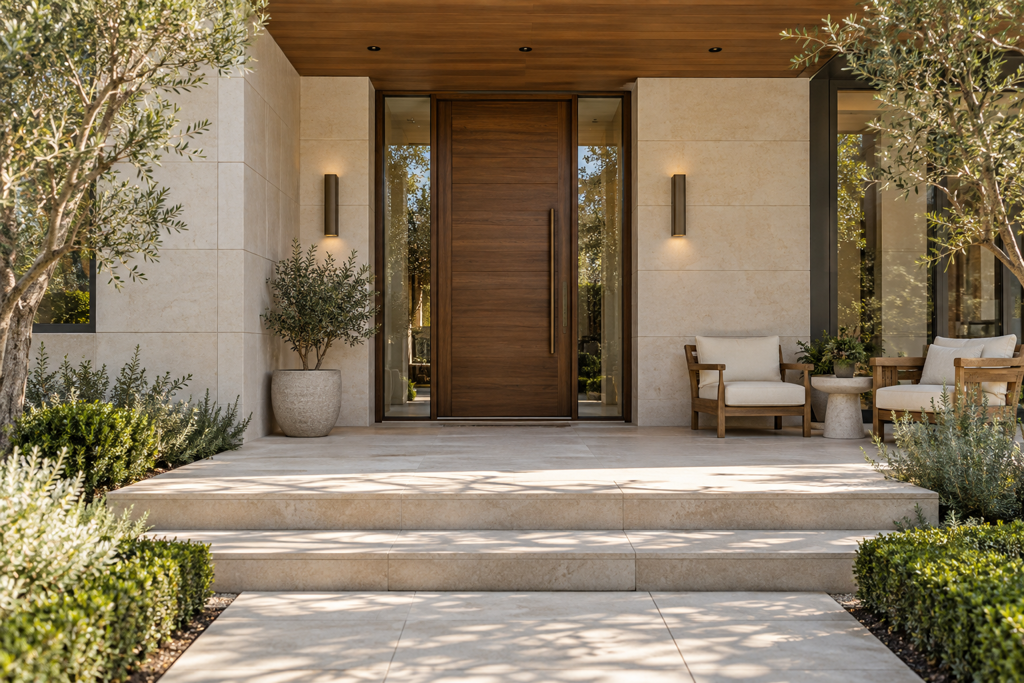
Elevation can solve a site problem while adding architectural interest. Stepped decks suit hillside homes, properties with grade changes, and larger front yards where seating, dining, and observation areas need separation. The levels can create a natural sequence from the sidewalk to the entry, but they must remain easy to understand and move through.
A multi-level design isn't automatically more functional. Extra steps can challenge older buyers, families with strollers, and anyone carrying groceries. Railings may improve safety while interrupting views. Different platform materials can clarify zones, but too many changes make the structure look fragmented. The design should explain why the elevation exists.
Show each level doing one job. A lower platform might hold two chairs, the central area might provide circulation, and an upper landing might frame the front door. Avoid filling every level with furniture. Empty space is useful here because it lets buyers see the route and understand the height changes.
For RoomStaging, generate versions with consistent materials across all levels, then test a controlled contrast between platforms. Correct perspective so the elevation reads accurately rather than appearing steeper or flatter than it is. Regenerate at dawn, midday, and dusk to see how shadows define the steps and railings.
A listing preview should never hide access limitations. If the design requires substantial stairs, show them clearly and use the visualization to improve flow, lighting, and planting rather than disguising the site's conditions.
10. Seamless Indoor-Outdoor Integration with Glazing and Transparency
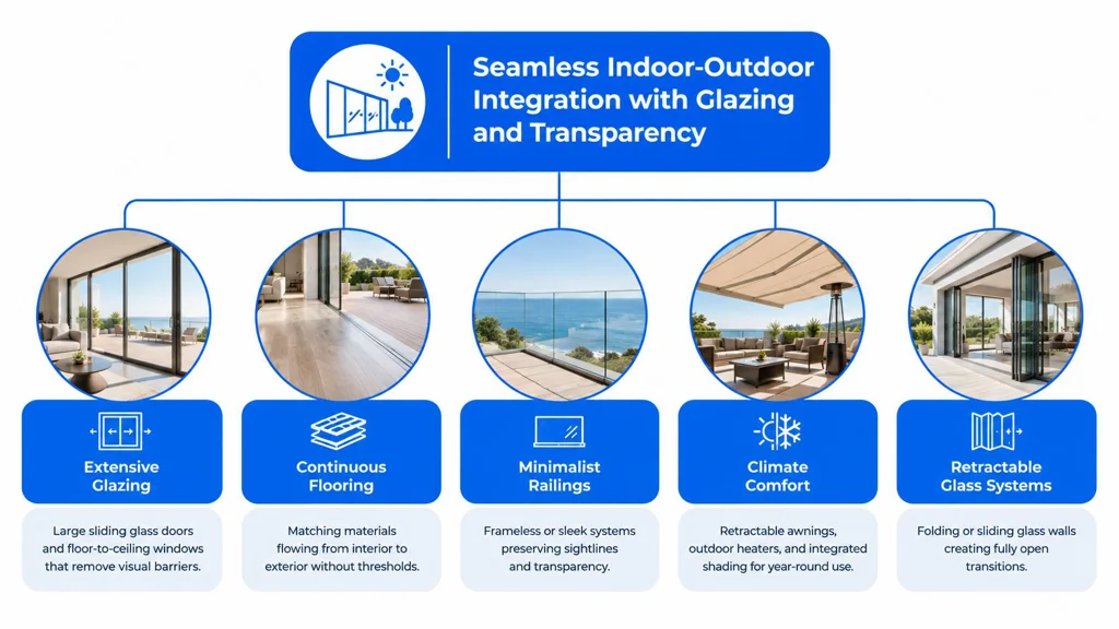
Large glazing, sliding glass systems, continuous flooring, and open sightlines can make a porch or deck feel like an extension of the interior. The concept suits minimalist homes, urban loft-style properties, and contemporary residences designed around open living.
The visual payoff comes from continuity. Matching tones inside and outside helps the eye travel through the glass, while a visible dining or lounge arrangement gives the exterior a purpose. Transparency also exposes clutter, glare, reflections, and mismatched furniture. Glass railings preserve views but demand regular cleaning and can feel less warm than wood or masonry.
Keep the transition legible. A small change in ceiling treatment, flooring texture, or lighting can define the boundary without creating a hard visual stop. Don't place bulky furniture directly against the glass. Interior furnishings should be visible enough to suggest connection, but not so prominent that the exterior reads as a showroom.
Use RoomStaging to generate before-and-after concepts for glass doors, railing styles, and connected furniture palettes. Enhance the photo to manage glare and reflections, then regenerate with interior furnishings visible through the glazing. The interior design feature can help test whether the inside and outside feel coordinated rather than merely transparent.
For marketing, transparency works best when the original architecture already supports it. A rendering shouldn't imply that a simple door replacement will produce a full open-plan transformation without structural, energy, privacy, and budget considerations. Show the design direction clearly, then verify feasibility with the appropriate builder or architect.
Modern Front Deck Ideas, 10-Point Comparison
| Style | Implementation complexity | Resource requirements | Expected outcomes | Ideal use cases | Key advantages |
|---|---|---|---|---|---|
| Minimalist Modern with Clean Lines | Medium, precise finishes and uncluttered execution | Moderate, neutral materials, minimal furnishings, regular upkeep | Clean, airy presentation that photographs well and highlights architecture | Urban condos, new construction, minimalist buyers | Timeless, space-enhancing aesthetic; excellent photographic clarity |
| Biophilic Design with Living Elements | Medium–High, living systems and irrigation integration | High, plants, soil, irrigation, seasonal maintenance | Lush, wellness-focused curb appeal with perceived higher value | Eco-conscious buyers, suburban and urban homes with sunlight | Enhances air quality and sustainability appeal; strong sensory impact |
| Industrial Chic with Exposed Materials | Medium, structural exposure and durable finishes | Moderate, brick, metal, concrete; minimal decor needed | Distinctive, photogenic, authentic aesthetic | Loft conversions, creative spaces, urban properties | Strong architectural character; low reliance on staging |
| Warm Transitional Style with Mixed Materials | Low–Medium, balanced mix of traditional and modern elements | Moderate, mixed woods, textiles, layered lighting | Broad market appeal and versatile, timeless presentation | Suburban homes and wide demographic listings | Highly versatile and easy to personalize for diverse buyers |
| Sustainable and Weathered Wood Decking | Medium, careful material sourcing and finish detailing | Variable, reclaimed wood costly; composites moderate | Warm, natural look that ages gracefully and signals sustainability | Coastal, farmhouse, eco-focused properties | Environmentally responsible appearance; warm, inviting photos |
| Contemporary Deck with Integrated Outdoor Living | High, zoning, built-ins, integrated systems | High, built seating, lighting, durable furnishings | Strong lifestyle appeal; perceived increase in usable living area | Families, entertainers, multi-use suburban and rooftop decks | Demonstrates functional outdoor living; excellent for staging scenarios |
| Architectural Statement with Geometric Shapes and Angles | High, complex geometry and precise construction | High, custom materials and specialized labor | Memorable, design-forward presentation; visually dramatic | Architect-designed homes and design-enthusiast buyers | Distinctive focal points; showcases design sophistication |
| Luxury Materials and High-End Finishes | High, precision installation and finishes | Very high, premium stone, exotic decking, specialist trades | Luxury market positioning and higher valuation potential | High-end estates, waterfront and luxury properties | Conveys exclusivity, durability, and premium photo appeal |
| Multi-Level Deck with Visual Separation and Flow | Very high, structural engineering and safety compliance | High, multiple surfaces, stairs, railings, lighting | Dramatic spatial interest and maximized usable area | Sloped sites and properties seeking architectural distinction | Functional zoning across levels; strong architectural impact |
| Seamless Indoor-Outdoor Integration with Glazing and Transparency | High, glazing systems, thresholds, thermal considerations | High, large glass systems, continuous flooring, climate control | Expanded perceived interior space, abundant light, flexible living | Modern open-plan homes and buyers valuing light and flow | Creates fluid indoor-outdoor living; excellent for cohesive staging |
Turn a Front-Entry Concept into a Clear Preview
The right choice depends less on trend language than on the property in front of you. A minimalist concrete entry may strengthen a flat-roofed townhouse, while a warm transitional porch may suit a broad suburban buyer pool more effectively. A biophilic scheme can improve a shaded facade, but only if the planting plan matches the available light and the owner's maintenance tolerance. Industrial materials may be appropriate for a converted warehouse and forced on a traditional subdivision home.
Start with the existing architecture. Note the roofline, window proportions, entry height, facade materials, sidewalk connection, and available depth. A porch is not just a decorative platform. Albuquerque's form-based code states that a porch shall be at least 5 feet deep and 12 feet wide, and it may be glazed or screened. The same code defines a porch as a raised enclosed area adjacent to the entry with direct access along the front facade. Those dimensions provide a useful planning reference, but local rules still govern a real project.
Construction details can also change the character of a concept. Fort Worth's Fairmount porch standards specify 3 1/2-inch tongue-and-groove wood flooring installed with a floor-nailer, and they require mitered corners on wrap-around porches. The guidance says railings should use wood or masonry appropriate to the structure's style, while metal handrails are reviewed case by case and should remain simple. Synthetic tongue-and-groove flooring may be accepted when it matches the existing size, profile, exposure, detail, relief, and dimension. These details show why a visualization should support a design conversation, not replace a code review or construction specification.
The best preview is the one that makes a real decision easier, not the one that looks most dramatic.
Create side-by-side RoomStaging variations instead of committing to a single untested concept. Begin with the original exterior photo. Compare clean lines, mixed materials, planting density, furniture zoning, lighting, and railing transparency while preserving the home's visible geometry. Then remove concepts that conflict with the property's architecture, intended buyer, budget direction, or maintenance expectations.
For listing work, keep one accurate architectural image and use lifestyle variations to communicate potential. For renovation planning, label each concept by its assumptions, such as new decking, added lighting, revised planting, or expanded glazing. That distinction protects credibility with buyers and gives contractors a clearer starting point.
A front entry should make the property easier to understand. Choose the concept that improves arrival, shows believable use, and remains convincing after the novelty of the rendering wears off.
RoomStaging lets you upload an exterior photo, test porch and facade materials, compare landscaping and lighting, and generate photorealistic variations that preserve the visible architecture. Create side-by-side previews for your property, then explore RoomStaging to refine the front-entry concept before planning or marketing.